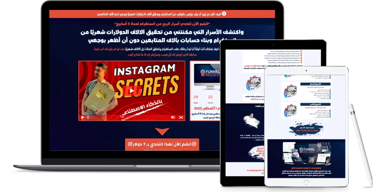
تنبيه: لكل من يُريد أن يبني بيزنس حقيقي من انستغرام ويحقق دخل محترم شهريًا ويصبح لديه آلاف المتابعين
"انضم الآن لتدريب أسرار العمل على انستغرام باستخدام الذكاء الاصطناعي"
واكتشف الأسرار التي مكنتني من تحقيق دخل محترم جدًا شهريًا من انستغرام وبناء حسابات بآلاف المتابعين دون أن أظهر بوجعي باستخدام الذكاء الاصطناعي
وستعرف كيف يُمكنك أنت أيضًا أن تبدأ رحلتك على انستغرام وتحقق دخل جيد وشهرة سريعة حتى لو لم يكن لك أي خبرة سابقة لأني أوضح لك كل شيء وسأوفر لك كل ما تحتاج للبدء
الخصم سينتهي يوم 31 أكتوير2024
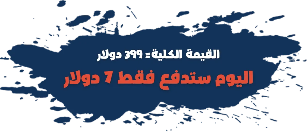
انضم الآن بـ 7 دولار فقط بدلًا من 399 دولار واكتشف أسرار العمل على انستغرام والربح منه أرقام جيدة عبر أكثر من 62 فيديو

اسأل نفسك هذه الأسئلة وأجب بمنطقية!!

رأيت الكثير من الأشخاص يربحون من انستغرام ولا تعرف كيف تبدأ؟!
ترغب في أن يكون لك كيان في انستغرام وتحقق مئات الدولارات شهريًا؟!
خائف من البداية في العمل أونلاين وتريد أن يكون معك خبير يساعدك في البدء؟!
لا تستطيع إنشاء فيديوهات أو مونتاج أو تسويق وتريد أن تعمل على انستغرام؟!
تريد أن يكون لديك حسابات بآلالاف المتابعين على انستغرام وتربح منهم؟!
لا تريد أن تظهر بوجهك وفي نفس الوقت تريد ان تبدا البزنس الخاص بك اون لاين؟!
إذا كانت إجابتك على أي من الأسئلة السابقة بـ "نعم" فهذا التدريب مناسب جدًا لك ... أكمل معي هذه الصفحة للنهاية لتعرف ما محتوى التدريب بالضبط وهل هو مفيد لك أم لا

هذا ليس الكورس الأول لي، كورس اليوتيوب السابق اشتراه أكثر من 10 آلاف متدرب
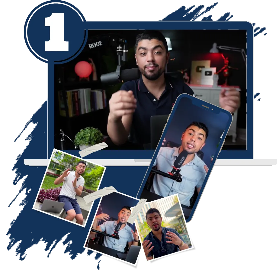
أهلًا بك صديقي، أنا فارس من من تونس، مقيم بدولة إندونيسيا (بالي) ... سني 25 عامًا، أعمل أونلاين منذ 7 سنوات وبفضل الله أمتلك حاليًا شركتين و 6 قنوات على يوتيوب، ولدي عدة حسابات كبيرة على انستغرام أحقق منها الآلاف شهريًا.
بفضل الله حاليًا أحقق من البيزنس الخاص بي ما يزيد عن 120 ألف دولار شهريًا ... سبق وأنشأت كورس أسرار الربح من يوتيوب وبفضل الله اشترى الكورس حتى الآن أكثر من 10 آلالاف طالب ومعظمهم حقق نجاحات أكثر من رائعة.
وطُلب مني كثيرًا أن أشرح طريقتي في العمل على انستغرام مثلما فعلت بيوتيوب وها أنا قررت عمل تدريب "أسرار الربح من انستغرام"
وهذا هو سبب إنشاء هذا التدريب من أجلك!!

دعني أخبرك بشيء مهم:
ما هي الصفة الأساسية التي يتمتع بها أصحاب الأعمال أونلاين ممن يحققون الآلاف عبر الإنترنت؟!
الإجابة باختصار هي: البداية!!
نعم مشكلة المعظم هي "الخوف من البداية" فتخيل أنا أقول لك عندي طريقة لو طبقتها ستحقق مبلغ جيد شهريًا من انستغرام بدلًا من أن تضيع وقتك على التصفح عليه وفقط كما يفعل البعض
فعليًا انستغرام كنز كبير وشخصيًا حققت منه مبالغ محترمة جدًا في فترة قصيرة والفرق كذلك بيني وبينك أني أملك عدة شركات وأقسم وقتي عليهم، فتخيل لو وضعت كل وقتي في انستغرام ....
أنك لا تحتاج لأموال كثيرة للبدء أو مهارات صعبة أو خبرة .. بالإضافة أن صناعة المحتوى على انستغرام أسهل من يوتيوب ولا تحتاج للابتوب بل ممكن تفعل كل شيء من الهاتف، والتخطيط والأدارة أسهل بكثير عن اليوتيوب ...
الشيء الأجمل بالعمل على انستغرام وما يجعله أفضل من يوتيوب في البداية؟!


هذا ما ستحصل عليه في هذا التدريب خلال الـ 10 محاور ... لتعرف ما ستحصل عليه قبل أن تشتري
المحور الأول
عقلية النجاح والفرص المتاحة داخل البيزنس
مقدمة مهمة جدًا قبل البدء في التحدي
عقلية النجاح أولًا قبل كل شيء
المهام اليومية للوصول للنجاح
كيفية طلب درس إضافي داخل الكورس؟!
المحور الثاني
أساسيات وفكرة عمل هذا البيزنس
ماذا ستتعلم؟ وأسلوب العمل الخاص بنا!
كيف تحدد أهدافك بدقة وتخطط للوصول لها؟
كيف تحدد عميلك المثالي وتحديد لغة الحساب
استعمال المنافسين لتحديد العميل المثالي
المحور الثالث
خوارزميات انستغرام
نظرة عامة على خوارزميات انستغرام
لا تفعل هذا إذا كنت تريد ان تنجح على انستقرام
عوامل النجاح على انستقرام
خوارزميات انستغرام (الروابط + المحتوى)

المحور الرابع
كيف تُخطط للمحتوى الخاص بك؟!
قاعدة الـ 100 المهمة جدًا
أنواع المحتوى وكيفية البحث عن أفكار للمحتوى
مكونات الفيديو الناجح
كيفية سرد الأحداث بطريقة تشد المشاهد

المحور الخامس
كيف تصنع محتوى قوي؟
أنواع المحتوى على انستقرام والادوات المطلوبة لصناعته
فيديوهات الحديث امام الكاميرا (كيفية الانشاء)
صناعة الفيديوهات بدون الظهور امام الكاميرا
صناعة الفيديوهات من خلال الذكاء الاصطناعي بالكامل
المحور السادس
استراتيجيات النجاح على انستغرام
ابدا من هنا للوصول الى 1000 عميل حقيقي خلال 30 يوم
الإنتشار على انستغرام باستعمال الهاشتاج
3 استراتيجيات قوية للإنتشار على انستغرام
تحس بالتشتت؟؟ ماذا تفعل الان ؟؟
المحور السابع
كيف تنشر المحتوى الخاص بك؟
ماذا ستتعلم في هذا المحور؟
كيف تفتح حساب انستقرام جديد وتجهزه للنشر
طريقة النشر الصحيحة على انستقرام
الوقت المناسب للنشر على انستقرام
المحور الثامن
كيف تسوق لنفسك عن طريق المؤثرين؟
فوائد التسويق عن طريق المؤثرين
ثلاثة استراتيجيات لبناء بزنس عن طريق المؤثرين
خطوات البحث عن مؤثرين
الخطوة الأخيرة: المهام والخطة لتبدأ

المحور التاسع
مرحلة التحليل والتحسين
ماذا ستتعلم في هذا المحور؟
كيف تحلل المنشورات الخاصة بك
كيف تحلل الحساب الخاص بك
استخدام البيانات للتحسين
المحور الأخير
ماذا أفعل الآن؟
ماذا أفعل الآن بعد انتهاء الكورس؟
المهام التي يجب أن أفعلها
الخطة الواضحة لتحقيق عائدات جيدة
تواصل معنا لأي سؤال في التدريب

ليس هذا كل ما في الأمر ... أشياء إضافية ستحصل عليها
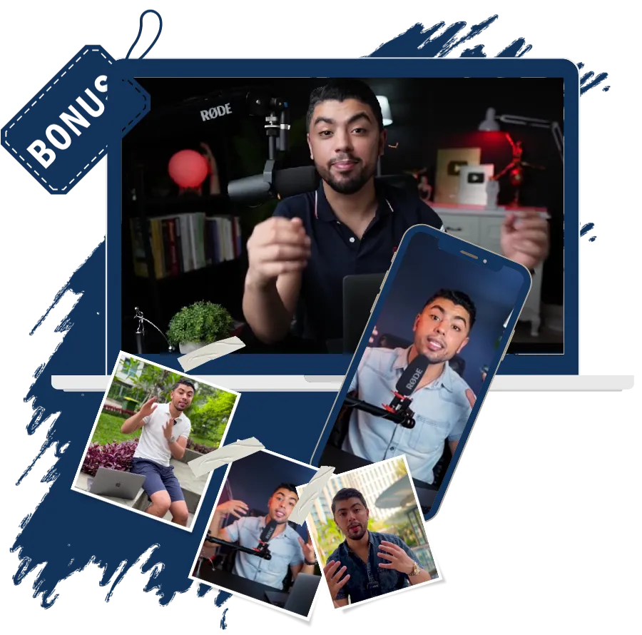
هدايا قيمة بالداخل
"ستحصل كذلك بداخل الكورس على هدايا قيمة وملفات وأشياء ومواقع ستساعدك في العمل بشكل كبير جدًا"
حساب كانفا لمدة عام
"كانفا هو المنصة الرئيسية التي ستحتاجها لعمل فيديوهات وصور وأشياء إضافية ستحتاجها جدًا لتطبيق هذا التدريب بشكل صحيح"
مجموعة فيس بوك خاصة
"ستنضم لمجموعة فيس بوك بها أكثر من 5000 شخص جاد فعلًا في بناء بيزنس أونلاين ... هذه المجموعة فرصة كبيرة لبناء علاقات"
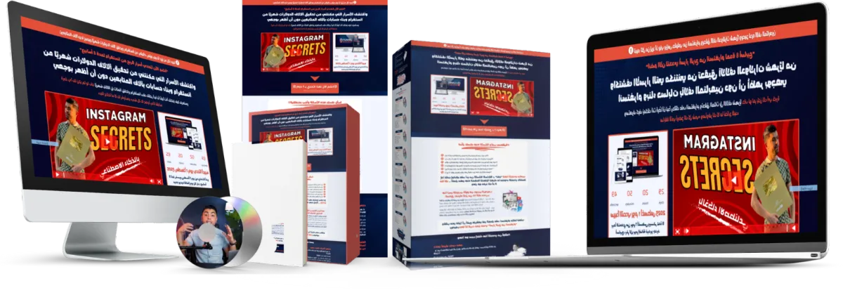
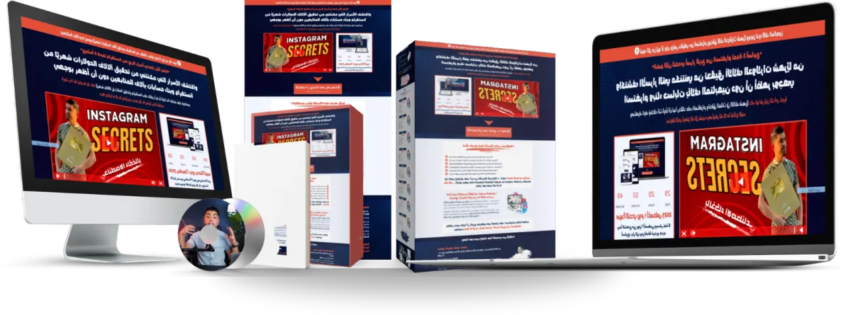
Instagram Secrets Training
خلال 10 محاور بأكثر من 62 فيديو ستحترف العمل على انستغرام وستعرف كل الأسرار التي دفعت في تعلمها آلالاف الدولارات، والتي مكنتني من بناء حسابات بآلالاف المتابعين وتحقيق مبالغ جيدة منها دون أن أظهر بوجهي باستخدام الذكاء الاصطناعي فقط

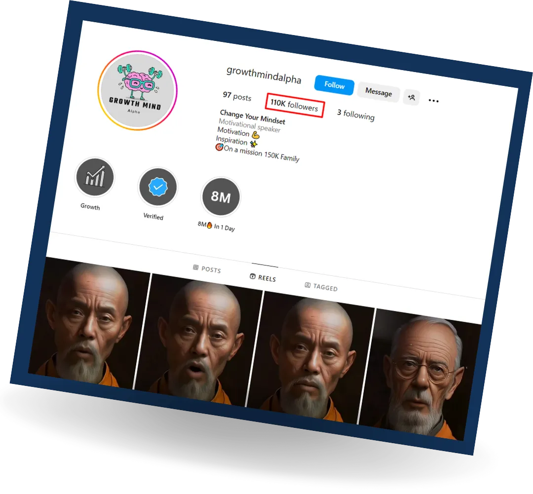
حساب للعمل بالذكاء الاصطناعي "به أكثر من 110 ألف متابع"
هذا الحساب الذي يضم أكثر من 110 ألف متابع والتي تم بناؤه في 4 أشهر فقط ... أساس محتوى الحساب بالكامل مبني على الذكاء الاصطناعي، يعني لا نبني المحتوى بنفسنا
يُمكنك مشاهدة الحساب من هذا الرابط
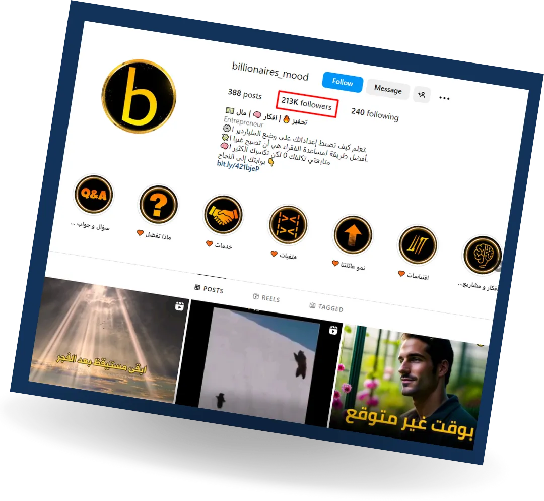
حساب الشركة الخاصة بنا "به أكثر من 210 ألف متابع"
هذا أحد حساباتنا على انستغرام والذي يخص الشركة، نحقق منه الآلاف شهريًا بفضل الله، يضم الحساب 213 ألف متابع حتى وقتنا هذا وفي تزايد مستمر
يُمكنك مشاهدة الحساب من هذا الرابط
هل أنت جاهز لتبدأ رحلتك المربحة على انستغرام؟!
ما الذي يُمكن أن تتوقعه من تدريب "أسرار الربح من انستغرام" الأقوى عربيًا والذي سيأخذ بيدك لبناء أول بيزنس لك
بعد هذا التدريب
تعرف كل ما يخص العمل على انستغرام
لا تضيع وقتك في التصفح بل تستغله في العمل
تبدأ في تحقيق المال عبر العمل على انستغرام
لديك مهارة إنشاء الفيديوهات عبر الهاتف
لديك مهارة تصميم صور احترافية من الهاتف
تعرف استغلال الذكاء الاصطناعي والربح منه
لديك عشرات العملاء أونلاين وتبيع لهم منتجك
قبل هذا التدريب
لا تعرف أي شيء عن العمل على انستغرام
تستخدم انستغرام للتصفح فقط وليس للعمل
لا تحقق أي دولار أونلاين وليس لديك بيزنس
لا تستطيع إنشاء فيديوهات من الهاتف
لا تمتلك مهارة تصميم الصور من الهاتف
لا تستغل الذكاء الاصطناعي للربح أونلاين
ليس لك أي عملاء أونلاين ولا تبيع أي شيء
"الإجابة عن أسئلة العملاء الشائعة"

كيف يُمكنني أن أدفع لشراء هذا التدريب؟
تم توفير وسائل متعددة للدفع، يُمكنك الدفع عبر الفيزا كارت، الحساب البنكي، باي بال، فودافون كاش بجمهورية مصر العربية ... فقط راسلنا على الإيميل [email protected] وسنساعدك بقدر ما نستطيع إن شاء الله
كيف سأدخل للتدريب عند شراؤه؟
بمجرد شراؤك ... سيصلك إيميل التأكيد والذي به معلومات الدخول لمنطقة الأعضاء التي بها كافة فيديوهات التدريب
هل هناك دعم فني مع التدريب؟
أكيد هذا شيء مهم جدًا بالنسبة لك ... كما أخبرتك فأنا هدفي أن أفيد وأستفيد وبالتالي أكيد هناك دعم فني، لو أردت السؤال عن أي شيء فأنا سأرد عليك بنفسي وكذلك سيكون معك فريق العمل بالكامل يرد على كافة الأسئلة إن شاء الله
لماذا تُقدم التدريب بهذا السعر البسيط، ما السر؟
بصراحة لا يوجد سر ولا شيء، فقط كل ما في الأمر أني أريد جذب أشخاص مهتمين يثقوا في ويتابعوني ويجدوا مني قيمة وفعليًا هذا التحدي قيمته عالية جدًا مقارنة بالمحتوى الموجود بها
هل أنت جاهز لتبدأ رحلتك المربحة على انستغرام؟!
اشترك الآن بوجود هذا الخصم على تدريب " أسرار الربح والعمل على انستغرام" وابدء رحلتك اليوم قبل الغد
محتوى شامل بأكثر من 62 فيديو تعرف فيهم كل ما يخص العمل على انستغرام
كيفية إنشاء حسابات انستغرام قوية وبناء دخل من خلالها
شرح شامل لاستخدام الذكاء الاصطناعي في إنشاء فيديوهات قوية
تعلم مهارة تصميم وإنشاء الصور والفيديوهات من الهاتف
شرح لأبسط الأدوات التي يُمكن استخدامها في إنشاء المحتوى القوي
خطة واضحة بمهام محددة تسير عليها لتحقيق أول دخل لك من انستغرام
مجموعة فيس بوك خاصة بمشتركي التدريب (قيمة جدًا)
حساب برو على كانفا لمدة عام كامل
الآن ستدفع فقط 7 دولار